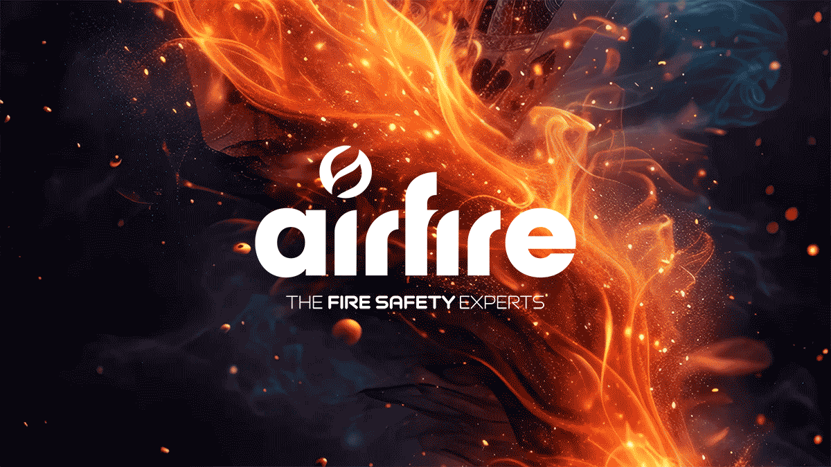
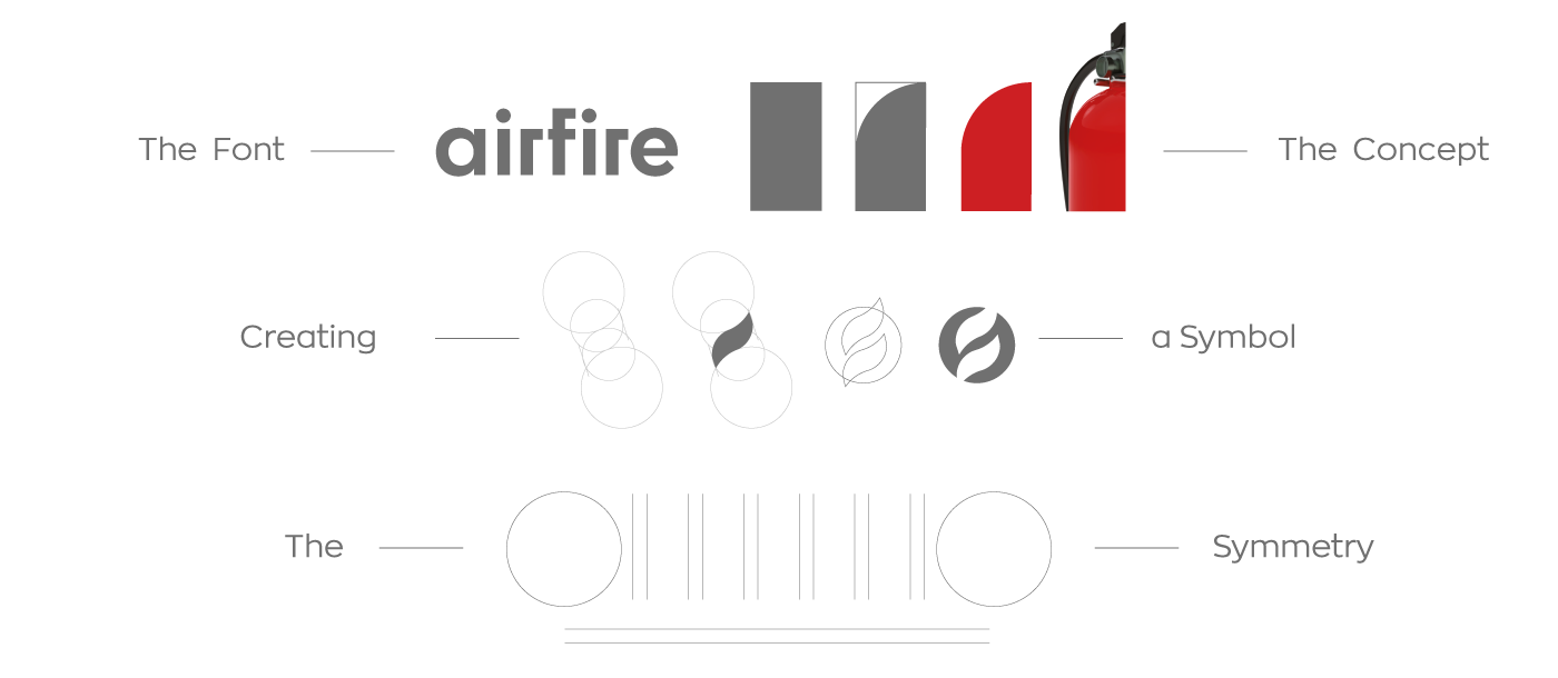
The Logo
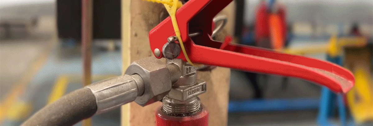
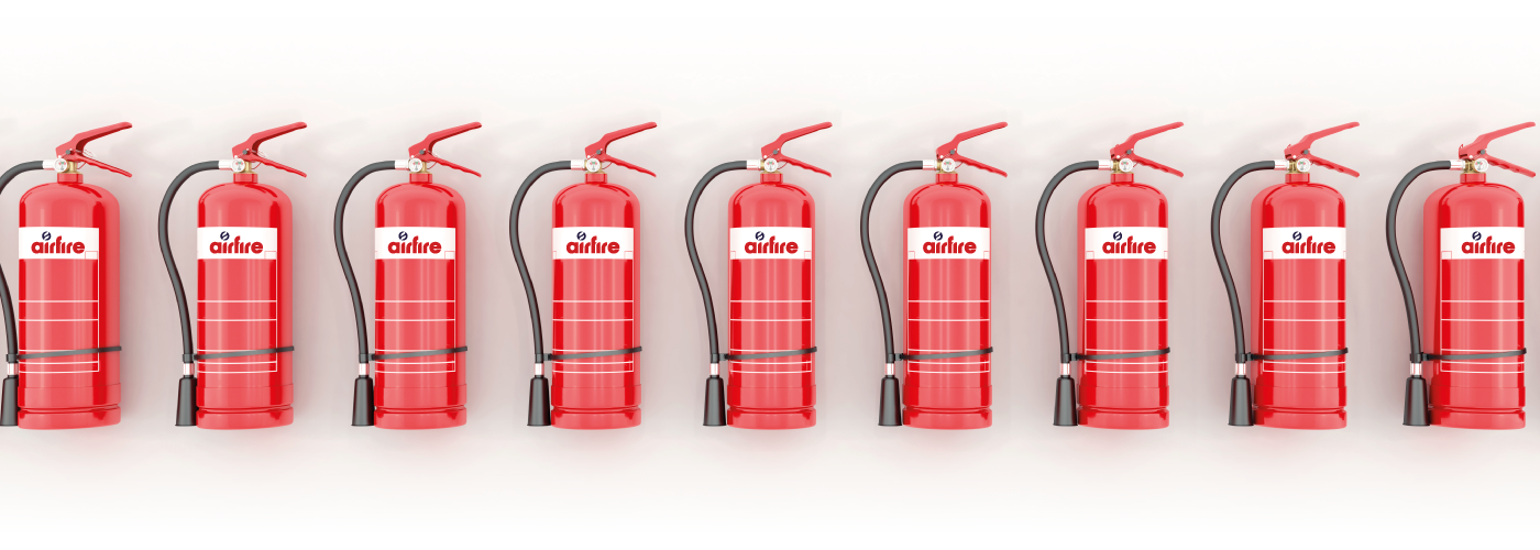
Firefighting is not just a process. It’s an entire universe and Airfire is here to dominate it. The classic fire extinguisher, big or small, is the first thing that comes to mind when we think of safety and action. It is the undeniable hero of our communication.
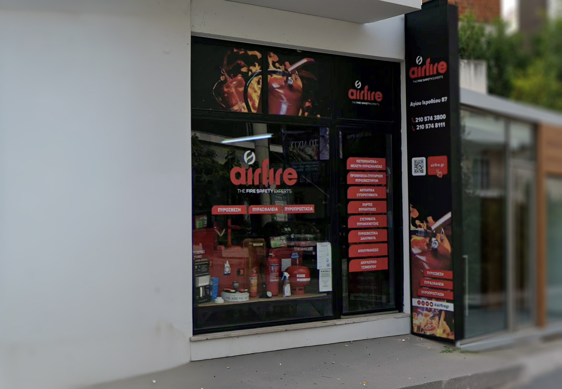
With a sleek, minimalistic, and powerful logo, we capture the simplicity and effectiveness of the fire extinguisher, sending a clear message: Airfire inspires trust, reliability, and excellence from the very first moment, delivering comprehensive services that never go unnoticed.
With a sleek, minimalistic, and powerful logo, we capture the simplicity and effectiveness of the fire extinguisher, sending a clear message: Airfire inspires trust, reliability, and excellence from the very first moment, delivering comprehensive services that never go unnoticed.


Origin
Crafted into art, guided by the iconic curve of the classic fire extinguisher, the result is a bold, powerful logo that radiates strength, recognition, and confidence.
Concept
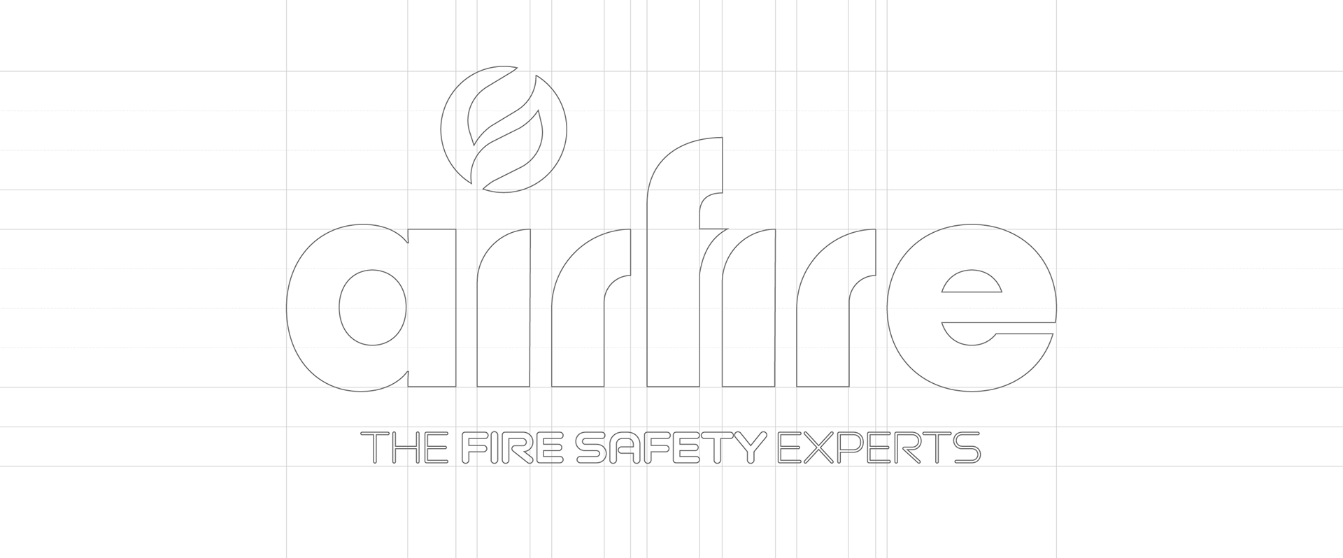
The logo starts with the font Cy. A typeface with cutting angles and magnetic rounded elements.
Airfire’s logo radiates symmetry and strength. From the rounded “a” and “e” at the edges to the commanding “f” at the center, every element guides the eye and reinforces the brand’s powerful identity. The tech-inspired tagline highlights expertise and the company’s mission: fire safety. A logo that doesn’t go unnoticed, it commands attention and trust from the very first moment.

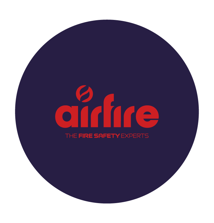
Colors
Contrast that stands out. Energy that commands.
In the logo’s composition, color contrast is the core element that captures attention and conveys Airfire’s dynamic energy.
Every hue is carefully chosen to enhance recognition, create impact, and radiate confidence in every application.
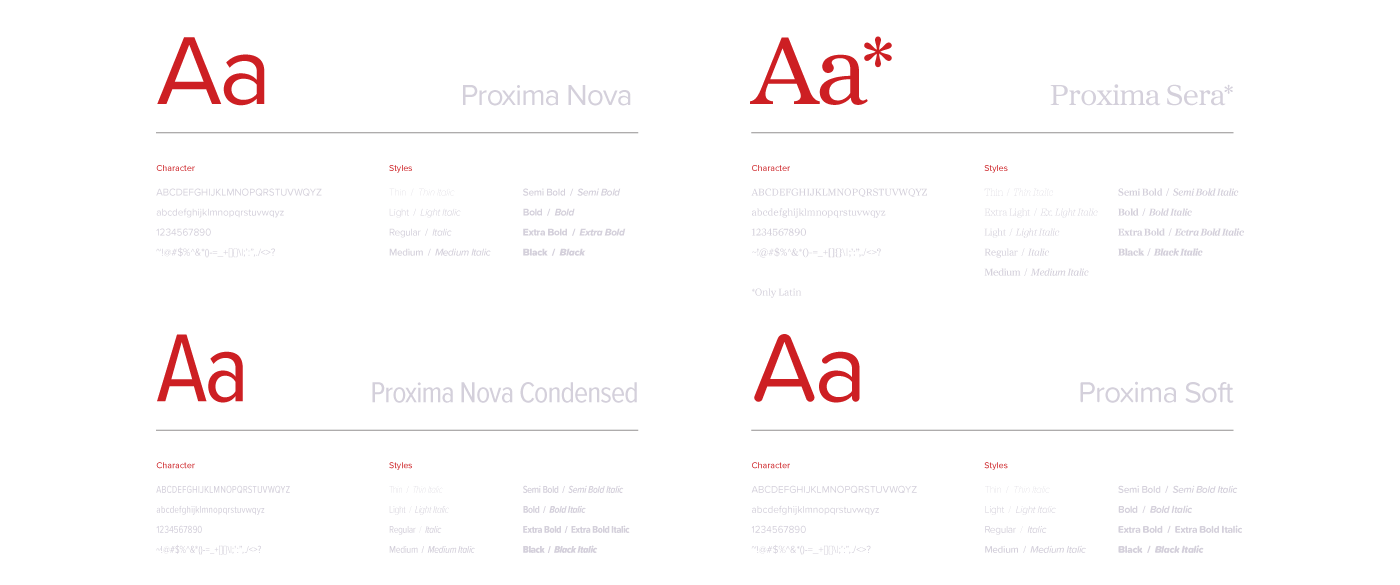
Fonts